ROCKET MORTGAGE
Protecting homebuyers through design
Recently, Rocket had a very specific problem that our product design team was uniquely positioned to support: we were discovering that a significant number of our customers had more debt than they were telling us about during mortgage origination, a weeks-long process in which all of a customer’s financials are disclosed to a lender in order to secure a home loan. Lenders determine what kind of mortgage you can get based on your debt-to-income ratio. The amount of debt you hold affects the terms of the loan, the interest rate, and the type of loan we can offer you—we may not even be able to lend to you after all. It’s kind of a big deal and we were losing ~$900k/week in business due to discovering applicant debt too late in the origination process.
THE ASK
As this was essentially a “ship taking on water situation” we had to put aside all other standing work requests to create a solution that would A) encourage customers to disclose ALL open debts and B) discourage them from opening new debts during mortgage origination. This was a rush which precluded any of the usual blue sky UX discovery we might otherwise do. The basic message our stakeholders wanted to get across, “Customers need to hear us say ‘Please, please tell us all your open debts and don’t open any new ones (for now)!’”) Actually, they just wanted a brick of text that said exactly that but we figured we could do something better.
DRAMATIS PERSONAE
The stakeholders:
VP of Legal Compliance (accountable), Director of Project Management (accountable, responsible), and 5-6 other project managers and in-house legal staff (consulted, informed)
The designers:
Senior Content Designer (me), Principal Experience Designer
DIAGNOSIS
There is an existing step in the origination user experience where we invite applicants to disclose all their open credit accounts (e.g., credit cards, car payment plans, etc.) during mortgage origination. It’s a required part of the application yet it’s proving an increasingly ineffective sieve at catching customer’s open debt. So…why might that be?

When an applicant clicks through, we ask them to disclose all their open debts— wait, what do we ask them?

We ask customers, “Have you opened new accounts with the following creditors?” Then we ask them to review a list of creditors who’ve “pulled [their] credit report.” We turned an active inquiry into a passive one. Additionally, we may be generating confusion by using too many different terms (new credit, new debt, new accounts) for the same thing. We’ve also buried the option to self-report new credit accounts towards the end before asking them to submit what will potentially be an unwieldy collection of information. A design approach that yields expediency and reduced friction for the customer (a single form) potentially may be sacrificing a more comprehensive picture of that customer’s debt.
RESEARCH
We’re fortunate to have close contact with the customer-facing side of our business, loan specialists who are in constant contact with applicants throughout the origination experience. Loan specialists are often the ones who discover these “hidden” debts and do their best to encourage customers to self-report these early. We asked them what kind of confusion arises at this stage and they told us that many customers believe one or more of these three things:
- The “credit pull” list represents all the credit accounts that we attribute to them (i.e., if we don’t see it here, it’s “invisible”).
- They don’t need to tell us about new credit accounts they open while they’re waiting for their home loan.
- “New credit accounts” are credit cards or lines of credit—not things like auto payments, student loans, etc.
These things are all untrue and yet they’re all reasonable misunderstandings based on the language/experience we’ve offered the customer. Mortgage origination is a hugely complex process that most of us only go through once in life, if ever. Rocket has a responsibility to hold the customer’s hand to some extent during this process. And while we do want to value their time and use as little of it as possible, we also don’t want that time-thriftiness to result in something as catastrophic as ineligibility for a home loan.
Our principal experience designer and I collaborated over multiple working sessions to synthesize all this signal.
Our working hypothesis: By applying greater consistency in language and unpacking a complex data gathering interaction, we can encourage clients to be more proactive about self-reporting debt.
DESIGN
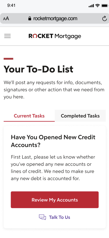
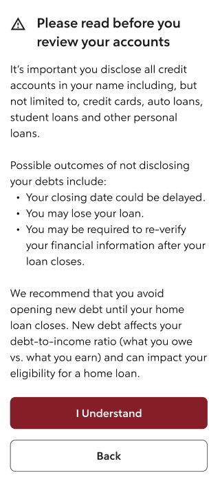
Remember up above where I said our stakeholders just wanted a brick of text that says, “Please, please tell us all your open debts (and don’t open any new ones)!” That actually seemed like a fairly reasonable ask given that we weren’t explicit enough about those points in the current experience. My goal is to say yes whenever I can so right after we ask customers to review their accounts (see Fig. 1) we can serve them this interaction:

Now no one hates a wall of text more than I do. A couple reasons for this:
1) People skim, especially on mobile. We can’t assume all this information has been ingested.
2) It’s one-dimensional to rely on text for a design solution. I generally believe that the desire to increase text implies a weak holistic design approach.
The more we drilled into the UX flaws of serving a block of text with our legal team, the more we realized this had to be part of our solution in some way. We opted to make this a stop-gap before user interactions rather than text at the top of those interactions (see fig. 2) to improve the odds of getting the customer’s attention.
To aid skimming, we wanted the consequences of not disclosing debt to be right in the middle in a bulleted list. So if that’s the first thing you read, you’re likelier to peruse the rest.
But, we argued, this wasn’t all of the solution. Per our hypothesis, we still wanted to make the language more consistent and unpack the experience of reviewing and submitting your debt information.

Now instead of inferring the all-seeing eye of the credit report, we’re letting them know we’ve “found” a series of credit accounts attributed to them and explained that credit accounts include credit cards, auto loans, etc. (see fig. 4).

We’ve also given them the opportunity to review this information before submitting, go back if they see anything amiss, and reiterated the importance of informing Rocket about changes in their financial situation.
Our stakeholders were really happy with this comprehensive approach to a solution and only requested a handful of minor copy edits.
THE RESULT
Over the first month of implementation, we saw a whopping 63% decrease in discovery of “undisclosed debt” while customers waited to close on a loan. Clearly there was some low-hanging fruit here we were lucky enough to pluck. This is the first of a series optimizations we implemented to the origination experience, perhaps the key Rocket user offering.