FIRST REPUBLIC | My Life

Recognizing a need to compel a new generation of homebuyers, First Republic began developing an immersive mortgage calculation experience dubbed My Life, a virtual journey for first-time homebuyers that:
- Delivers the “white-glove” service they could expect from the Bank.
- Educates and sets expectations for prospective homebuyers new to mortgage lending.
The Ask
Develop an interactive calculator (the “Comfort-ability Calculator”) that lets prospective homebuyers see if they can afford a home based on their budget, debt-to-income ratio, and other financial obligations.
The Stakeholders
VP of Brand Strategy, Creative Director
The Team
Senior UX Designer, Project Manager
My Role
Within an extensive cross-functional team, I contributed copy and strategy to key aspects of this experience: helpful prompts, explanatory micro-copy, and content consolidations that will help prospective homebuyers move through this experience quickly, even enjoyably.
I worked closely with our creative director to craft language that incorporated insights from multiple user tests as well as our own research into similar products at other banks. At every stage, our designer and PM ensured we were applying UX best practices and “designing” our text for the most aesthetically compelling experience possible (i.e., not too many words, just the right ones).
The Result

The first touch point. The homebuying process can be daunting so it was on us to make this as warm and inviting as possible. I offered text options for the animated search bar to help stimulate user interest.
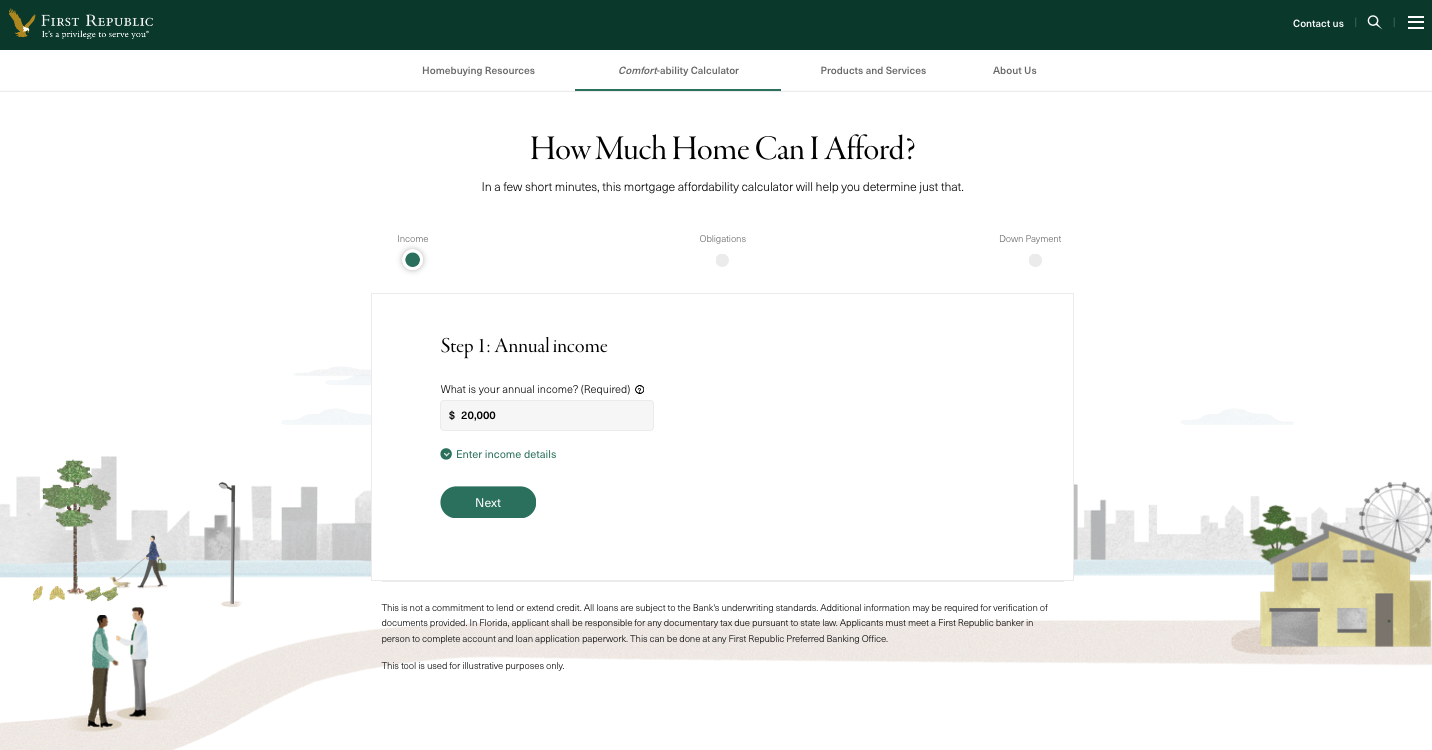
This is the beginning of the new home affordability calculation. We’re setting expectations for a short, three-step process that’s free of jargon.
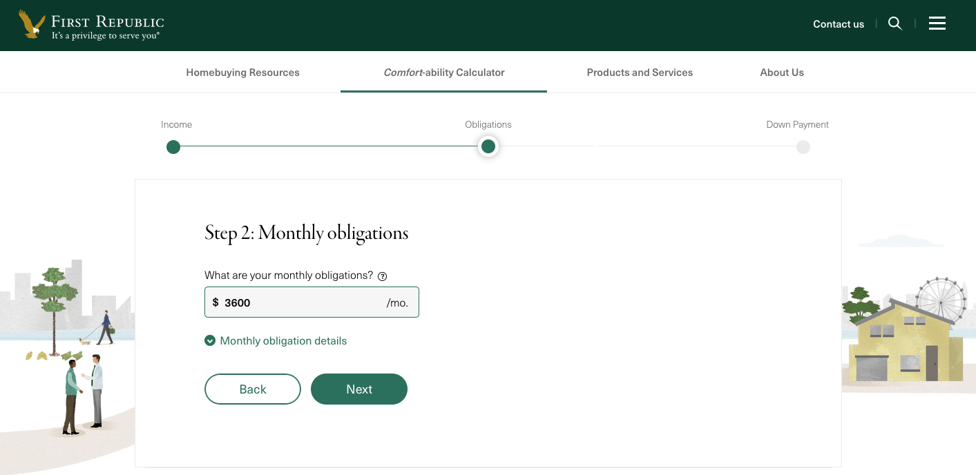
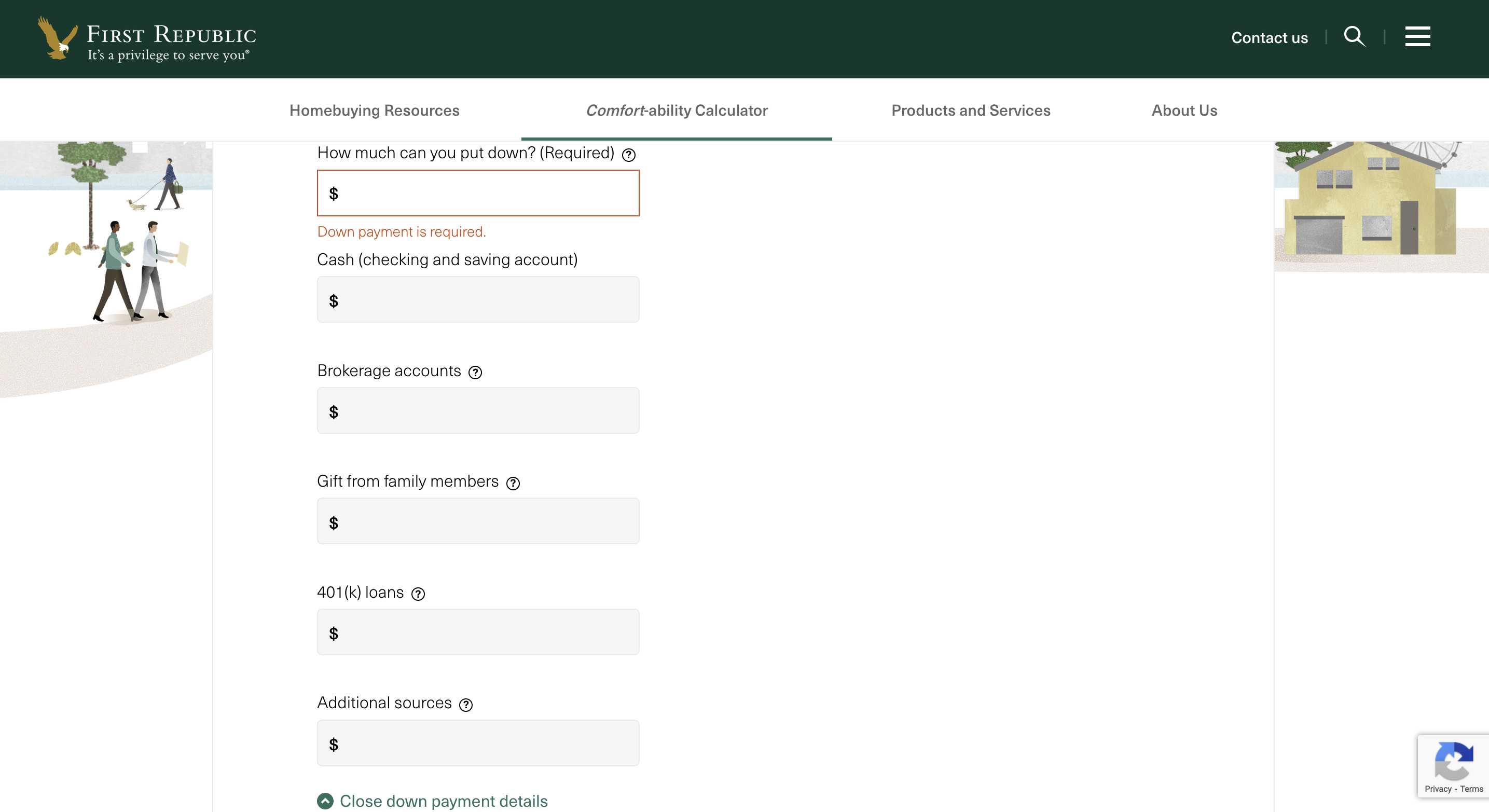
We give the user the option to input their current non-housing financial obligations as either a lump sum…
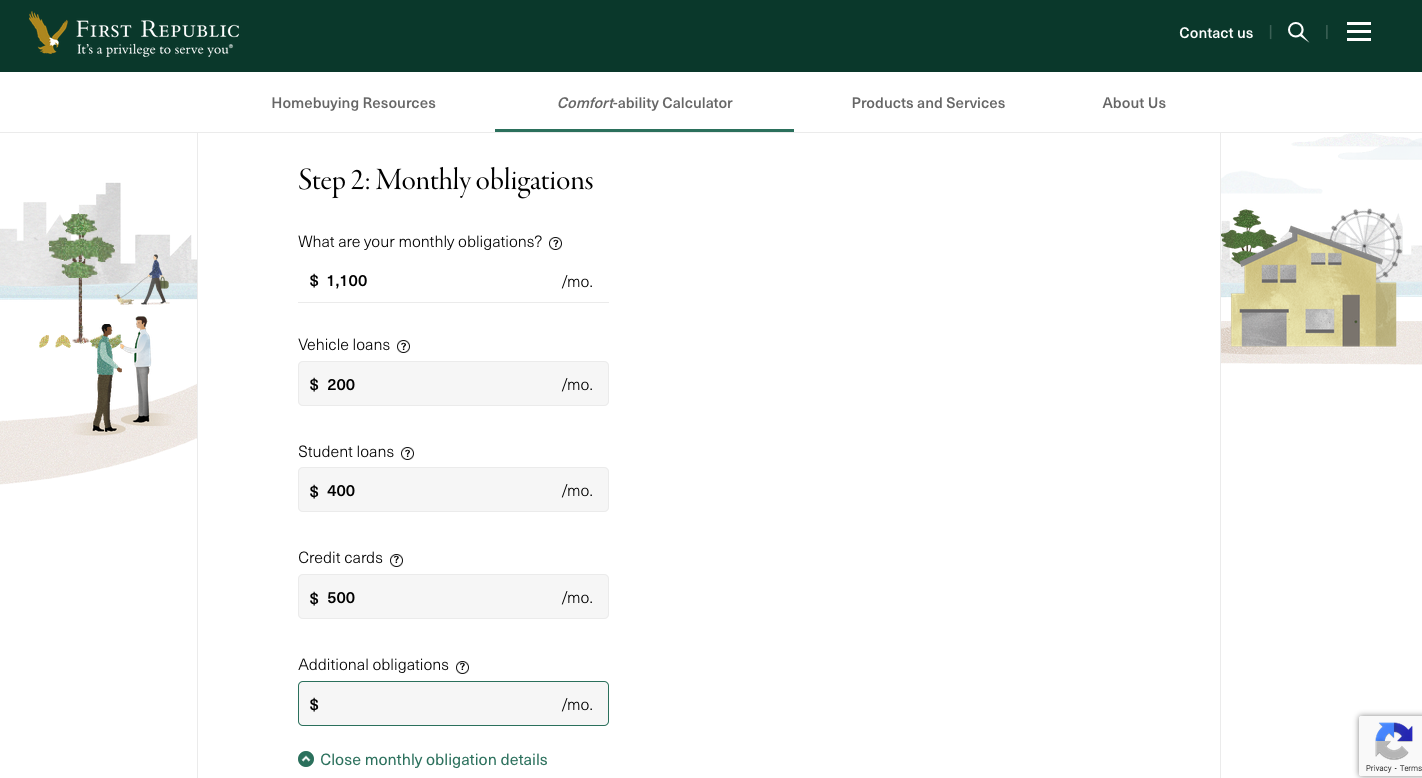
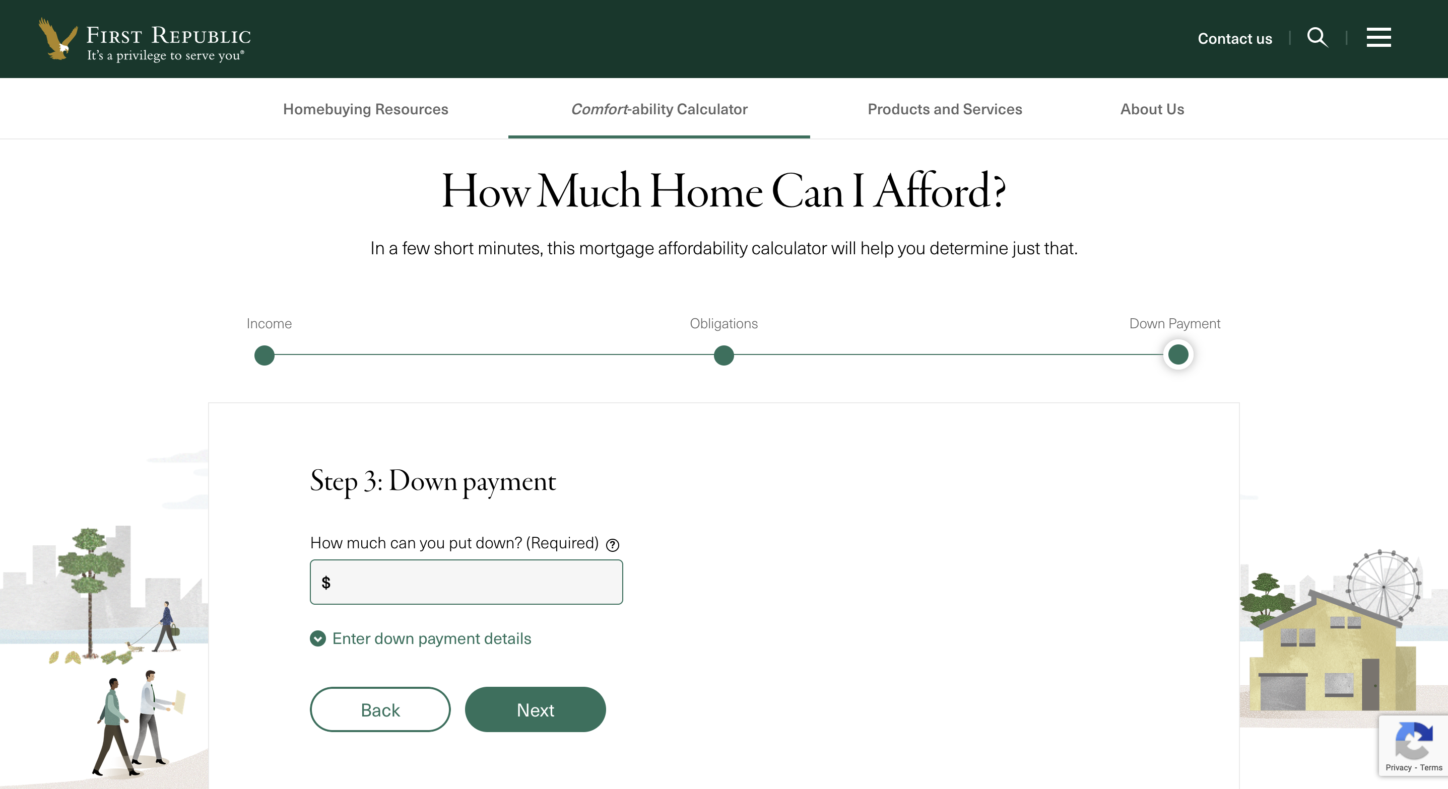
…or as a breakdown. This accordion-style value input form came in response to feedback we’d received from clients and bankers that there was often confusion about which aspect of personal finances “mattered” for the mortgage process. The UX designer and I advocated for consolidating the various input fields and categorizing them as Income, Obligations, and Down Payment. This consolidation would speed up the user experience as well as help users visualize how their personal finances correspond to each step of the homebuying process.
For the user results, our creative director and VP identified three outcomes for prospects:
- Prospect can afford home
- Prospect can afford home with adjustments
- Prospect cannot afford home
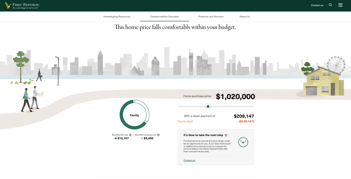
Comfy is state 1 (prospect can afford home). I created the explanation for our calculations (more on that below), while our UX designer implemented an interactive slider that enables prospects to visualize different homebuying scenarios in real time.
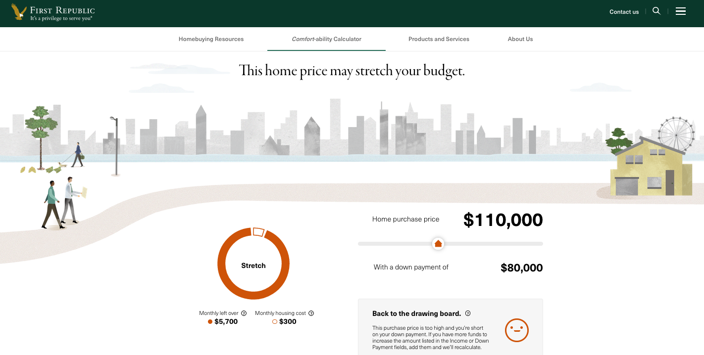
If you slide a bit to the right, you will find yourself in state 2 (user can afford home, with adjustments). Stretch indicates that while you are not ready to proceed as is, with modifications the home in question may in fact be within reach.
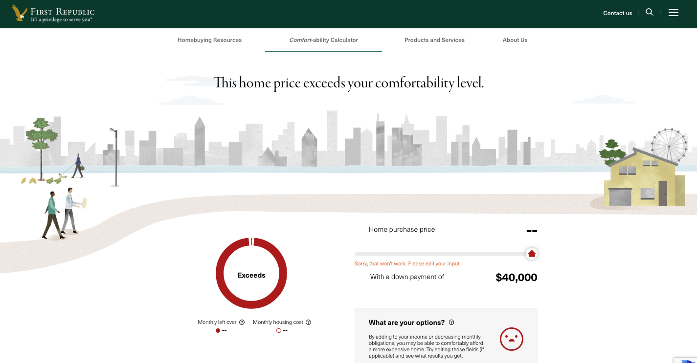
If you slide yet further right, you find yourself in state 3 (user cannot afford home). I was asked to define the third outcome in such a way that expressed the fact that the home was out of the user’s price range without crushing them. I offered exceeds—not soul crushing, not needlessly ambiguous, and it presents the user with a correctable state as opposed to a certain fate.
Lastly, realizing that even our most promising clients find themselves initially challenged by the fiscal realities of the markets we serve, our creative director of writing and I focused on encouraging micro-copy prompts for each outcome that would drive home the white-glove experience that was fundamental to the Bank’s brand. The key was to imagine what a banker might say if they were guiding a prospect through the calculator in person. Here’s my contribution to the Exceeds outcome:
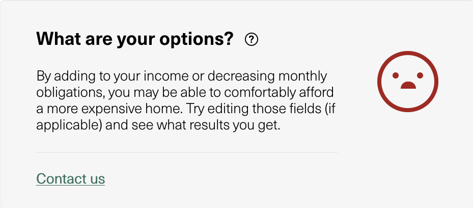
The homebuying process can be a gauntlet. As such, prospects approach lenders with more than a little vulnerability. The experience of interacting with this mortgage calculator should be the beginning of a conversation and never the end of one. Regardless of where the user is financially, this is not the time to tell them “no.”
After this site debuted, our bankers reported a 20% uptick in leads from prospective buyers reaching out from the calculator contact form to begin the lending process. Bankers also found that these clients were much better versed in the financial realities of homebuying due in part to the educational aspects of the calculator experience.